
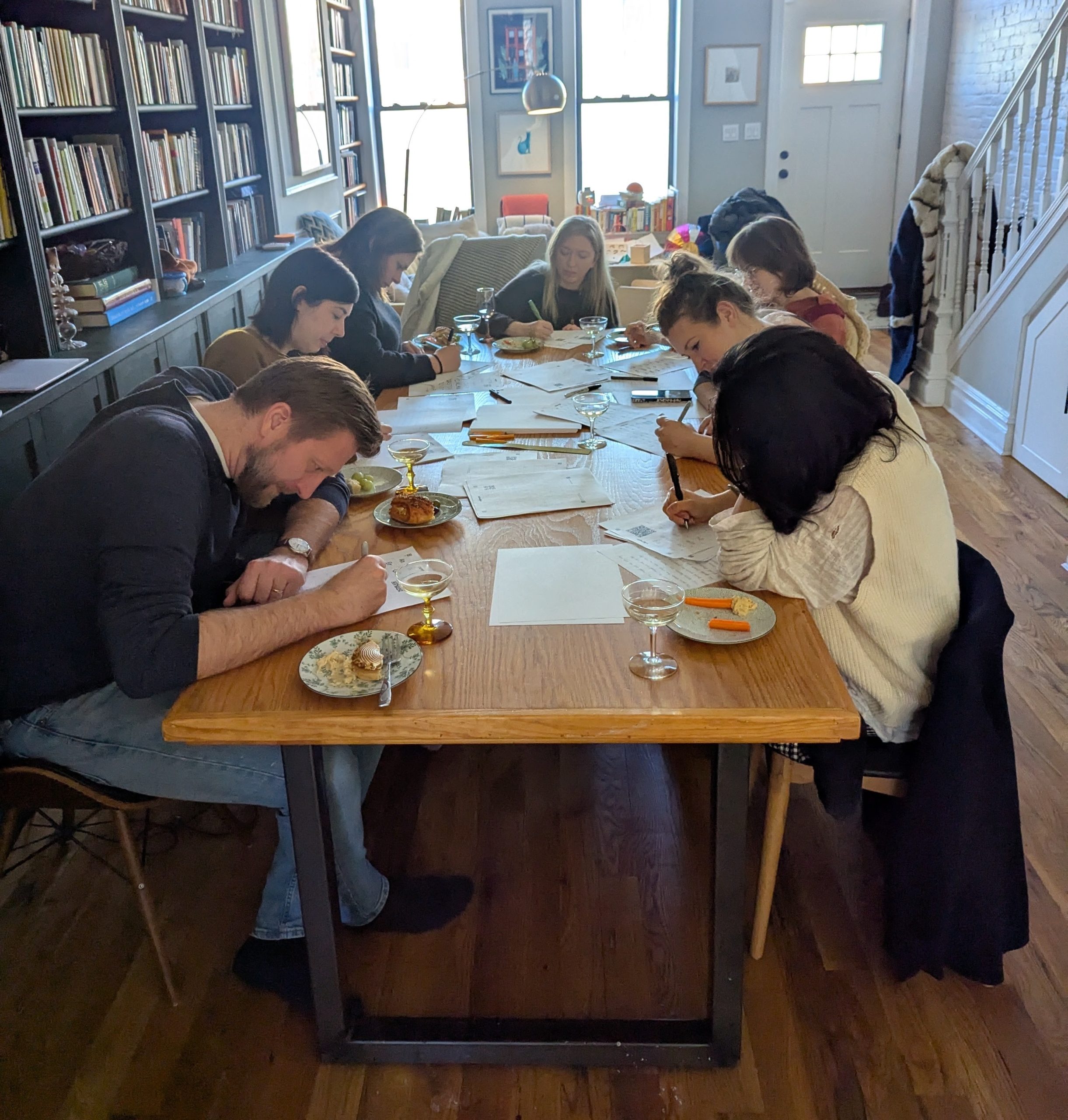
Kristen Raddtke and friends at a Calligraphr font workshop that she hosted. | Photo by Jeffery Gleaves / The Verge
Kristen Radtke is creative director at The Verge. “I work with the art team on the overall look and feel of the site across illustrations, photos, and branding,” she explains. “I also design feature stories and custom packages.” One of her favorite software packages is Calligraphr, and so we asked her about it.
What exactly is Calligraphr?
Calligraphr is web-based software that will help you turn your handwriting into a font. You don’t need Photoshop or any image-editing software, just access to a printer to print out one of the templates that Calligraphr provides. You then draw your alphabet using the template. When you’re done, you snap a picture with your phone and then edit the individual letters in Calligraphr. It’s super affordable — you can do a lot with the free version, and full functionality costs $8 for a month or $24 for six months. The payment doesn’t automatically renew, which is great.
When did you first start using Calligraphr?
I’ve tried a bunch of different DIY font makers, and Calligraphr is the easiest to use that I’ve found so far, with the most professional-looking results. In early March, I hosted a fontmaking workshop with some friends as a casual skillshare and an excuse to get together and eat snacks. I did a full sample of my font using Calligraphr to get familiar with it, and it only took me a few hours.
Each of my friends was able to complete their font in the afternoon (more or less — two said they had to finish cleaning up the files that night before exporting). It was such a fun, breezy project!
Why did you get it?
When I draw comics and graphic stories, I need my handwriting for dialogue, captions, and text. Traditionally, cartoonists would do all this lettering by hand, but a lot of us just turn our handwriting into a font. I have to write really slowly for my handwriting to be legible — my notebooks are truly incomprehensible messes — so lettering digitally is a borderline necessity for me. Prior to using Calligraphr, the last font I made was around 2019 (I can’t remember what software I used), and I knew I needed a tune-up. There were some spacing and kerning problems in that font that I wanted to brush up to make it look more natural and more like real handwriting.
What do you like about it?
It’s easy! It’s cheap! It’s fast! For such simple software, you can do a lot of adjustments. You can include variants, so you have multiple letters for a single character, and the font will randomly assign different variants when you type, creating a more hand-drawn effect. It’s helpful to be able to adjust the padding around each individual letter, since all letters need a different amount of space around them in order to look readable and correct. An “O,” for example, has a lot of negative space in its four corners, whereas an “H” has none. So I made the bounding box around the “O” tighter than around the “H” in order for those letters to look correctly spaced when I’m using them in a word or sentence.
The ligature function, which comes with the paid version, is also useful, especially if you write in cursive or link certain letters when you’re writing fast (when I write “ing,” for example, I tend to connect the “n” to the “g,” even if I’m not writing in cursive). The one note here is that you need to make sure you have ligatures enabled in InDesign or Photoshop (or whatever program you’re going to use your font in, after you’re done) for those variations to work.
Is there anything about it that you wish were different, or that you think would improve it?
The letters can take a while to clean up – sometimes there’s a random speck in the background, or one part of the line is a little thin – but the tools are really straightforward. It just takes a bit of getting used to.
Who would you recommend it to?
Anybody who wants a font of their handwriting, regardless of your design/technical ability. You can use it for professional purposes or just for fun – I’m thinking about using it to send out birthday cards, because I love mail but hate writing by hand (and I get so sloppy that people probably can’t read what I write, anyway).